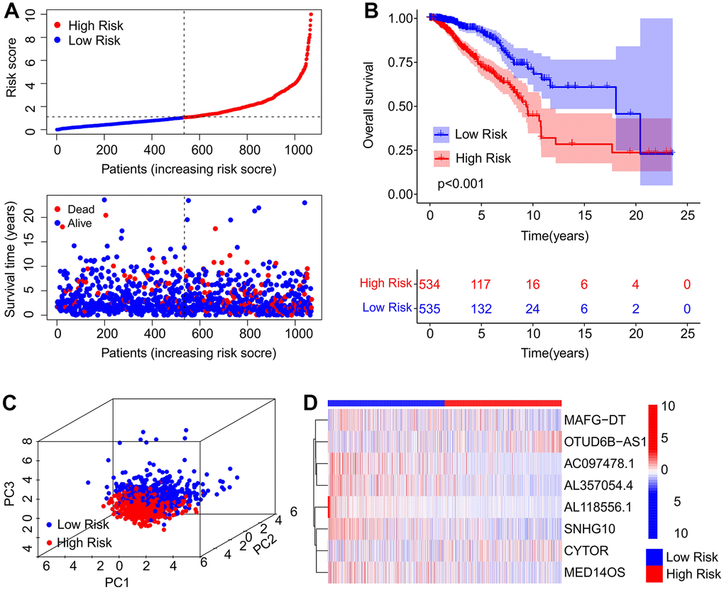
Figure 2.Risk model construction of the prognostic ARLs. (A) Distribution of risk score and scatter dot plot showing the correlation of survival time and risk score. (B) Kaplan-Meier survival curve suggests that the OS of patients in the high-risk group is significantly shorter than that in the low-risk group. (C) Principal component analysis (PCA) illustrates a significant difference between the low-risk group and high-risk group based on the ARL prognostic signature. (D) Heatmap showing the expression of the eight prognostic ARLs in the low- and high-risk groups.
