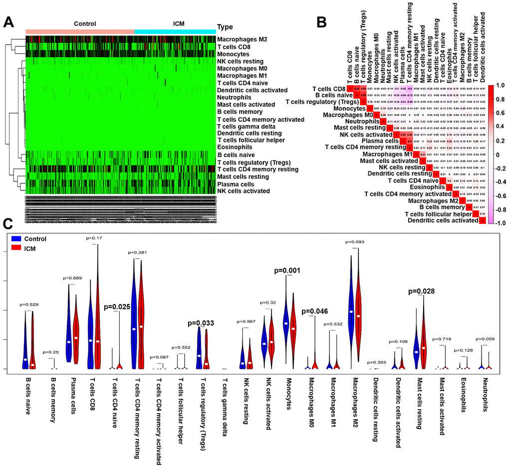
Figure 6.Pattern of immune cell subtype infiltration in the training set. (A) Heatmap of the 22 immune cell proportions in each sample. (B) Correlation heatmap of the 22 immune cells. The deeper the red, the stronger the positive correlation. The darker the pink, the stronger the negative correlation. (C) Representative violin plot showing the different fractions of infiltrated immune cells.
