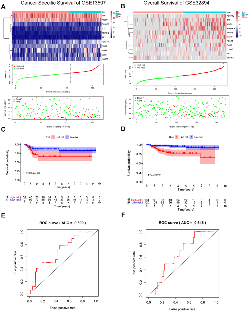
Figure 8.Validation of the risk signature in GSE13507 and GSE32894 datasets. (A, B) Heatmap of the 11 IRGs expression distribution, risk score distribution, and survival status between the low-risk group and high-risk group in the validation cohort. (C, D) Kaplan–Meier curve showed shorter survival time in the high-risk group patients. (E, F) ROC curve illustrated the prognostic value of the risk signature.