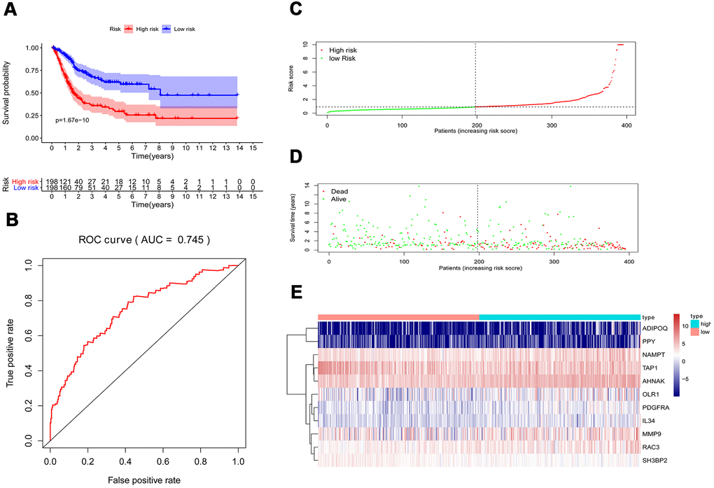
Figure 6.Prognostic risk model of the cohort. (A) Kaplan–Meier curve analysis showed that patients with a high-risk score were correlated with a worse survival outcome (p < 0.05). (B) ROC curve analysis of the prognostic risk model. (C) Risk score distribution of patients in the prognostic risk model in the cohort. (D) Survival status scatter plots for patients in the prognostic risk model. (E) Heatmap showing the distribution of the expression of the 11 immune-related genes in the cohort.
