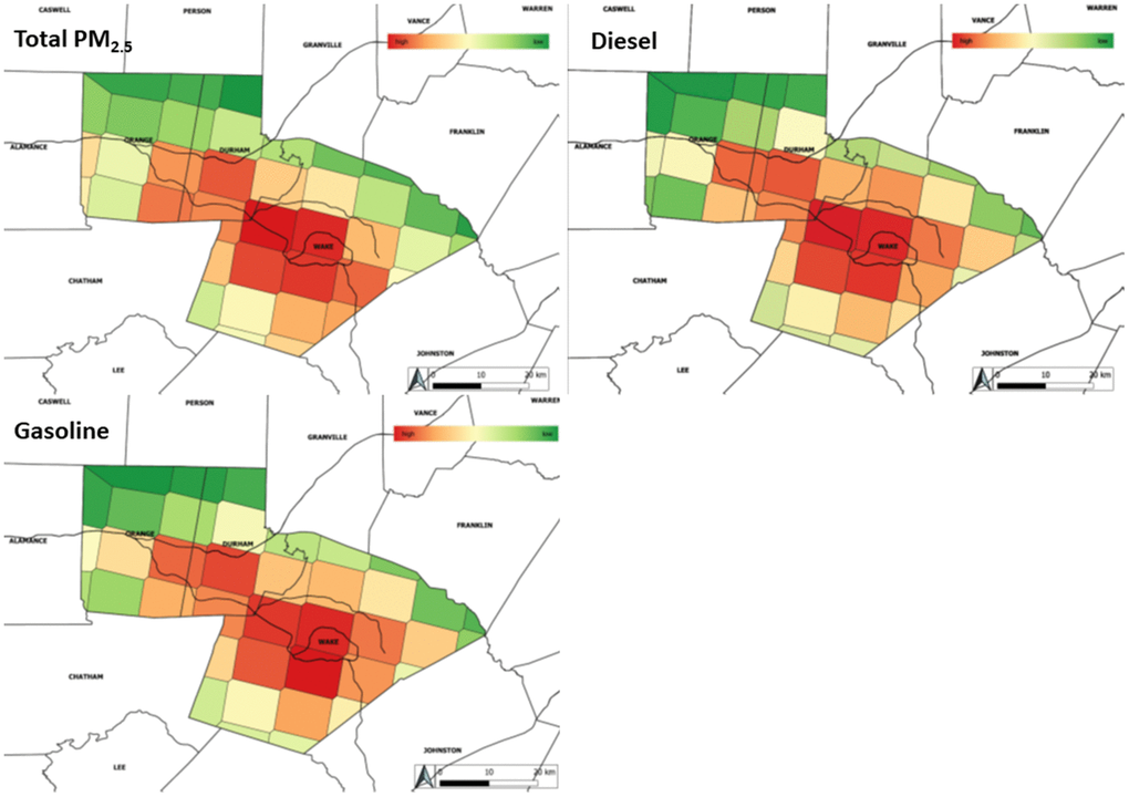
Figure 1.Distribution of total PM2.5 and source-apportioned PM2.5 averaged over all study years. gives the distribution of total PM2.5 mass as well as diesel and gasoline source-apportioned PM2.5. As expected for urban counties, the distribution of diesel and gasoline source-apportioned PM2.5 closely matches the distribution of total PM2.5. Lower levels of pollutants are given in green with high levels shading towards red.