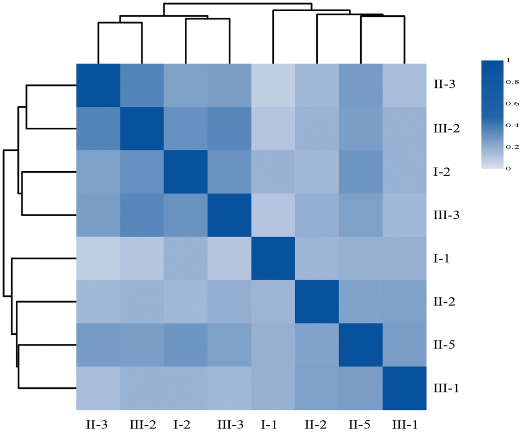
Figure 6.The heatmap of Person’s correlation between members of the Family according to their respective gene abundance. Rows and columns represent individuals, on the left is the clustering of the sample. Different colors reflect the corresponding correlation coefficient.
