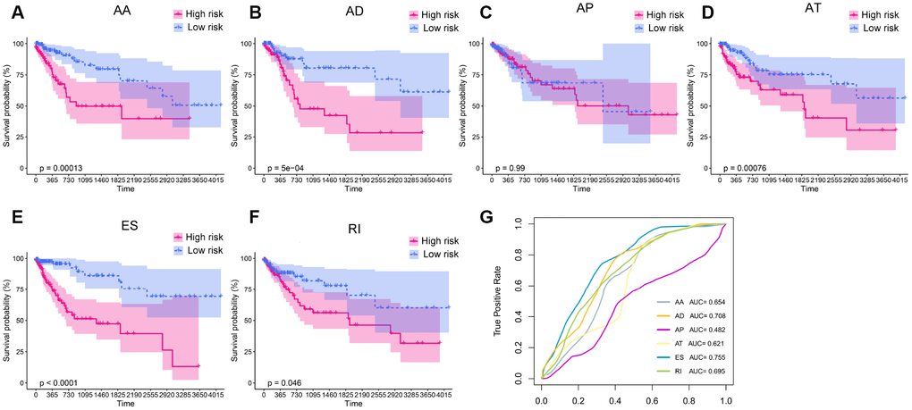
Figure 4.Kaplan-Meier plots and ROC curves of prognostic models for different AS patterns. (A–F) Kaplan-Meier curves of prognostic models built with the AA, AD, AP, AT, ES and RI patterns of AS, respectively. The red line indicates the high-risk group, whereas the blue line indicates the low-risk group. (G) The ROC curves of the predictive models for the different AS patterns.