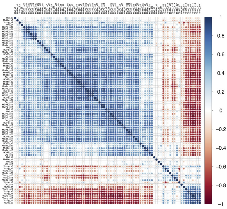
Figure 2.Pearson's correlation plot build for “Young”, “Middle”, “Old” and “HGPS” groups of fibroblasts. Samples from all datasets are combined and named according to the group they belong to. Scale bar colors indicate the sign and magnitude of Pearson's correlation coefficient between samples.
